Planning (Title Sequences)
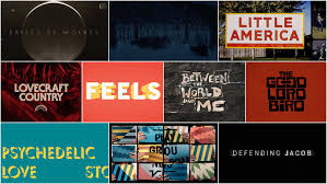
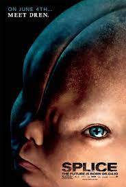
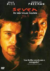
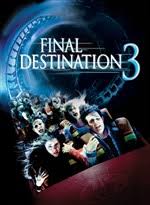
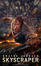
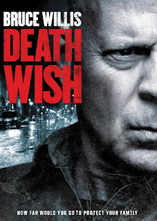
This is our groups information on the specifics on our title sequences through our film: Font: We will use a solid, blocky style large bold font, that gives an intimidating feel and captures the goal of our overall thriller genre, and suspenseful tone throughout. Colors: For the most part, darker, more bold colors will be used in our title sequence, we want the focus to be on the film itself and bright colors risk the audiences attention from being taken away from that. Size: We are going to use a smaller font size in our title sequence, nevertheless we are sure to make the font plenty big for our audience to be able to recognize who took part in this film. But, again we want most of the attention to be drawn towards the film we are working so hard to create! Working title: Our working title will contain all of our actors, as well as behind the scenes participants, who edited. Who worked on sound choice, costumes, and overall all of our conventions that we learned. We also will en...
