There are many different distinct conventions in Far from home. I watched the Far from home today since I am studying the thriller genre. The movie was very good and it helped me understand the conventions in thriller films. One thing I noticed is that there was a lot of tracking shots tracking spider-man. It tracked him on the webs. Thriller movies track the main character so the audience doesn't lose attention of the main character, such as they did in Far from home. The sound in the movie was very mysterious, as something was about to happen. Since the villain in Far from home was Dr. Curt. Connors, they made the sound creepy every time he was present. I noticed in thrillers that the sound is very similar in all of them. Spider-man has his costume and the props he uses in the movie. I noticed in thriller that everyone has certain costumes and props to match what there character is. Peter Parker also gets many flashbacks to when he was a kid. He also gets flashbacks ...
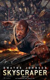
Conventions that we liked: There was a lot of conventions used in this film that our group likes. The angles and the clamps have their own purposes. We liked that the costumes because they were very casual since the movie takes place in a skyscraper. They were also props such as machine guns being shot, during the rising action of the movie. We like that it gives the audience a sense of suspense with the guns being shot. The lighting used since its in a big city gives a thrilling vibe. We definitely want to use a certain lighting in our film. The lighting gives a natural thrilling feel. Finally, we like the sound used in the movie. The sound of suspense attracts the audience which is very good for the film. Conventions that my group didn't like: My group didn't like certain things found in the film. For one, the editing used seemed partially synthetic, and not believe able enough to the eye, although as we watched the film it did seem like a budget film hence the editing was n...
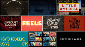
This is our groups information on the specifics on our title sequences through our film: Font: We will use a solid, blocky style large bold font, that gives an intimidating feel and captures the goal of our overall thriller genre, and suspenseful tone throughout. Colors: For the most part, darker, more bold colors will be used in our title sequence, we want the focus to be on the film itself and bright colors risk the audiences attention from being taken away from that. Size: We are going to use a smaller font size in our title sequence, nevertheless we are sure to make the font plenty big for our audience to be able to recognize who took part in this film. But, again we want most of the attention to be drawn towards the film we are working so hard to create! Working title: Our working title will contain all of our actors, as well as behind the scenes participants, who edited. Who worked on sound choice, costumes, and overall all of our conventions that we learned. We also will en...

Comments
Post a Comment